Skip to main
University-wide Navigation

What is a poster presentation?

A poster is a succinct presentation of information (research or clinical info), usually a combination of text and images. It is a popular way to disseminate information to others in your discipline. Many conferences welcome poster as well as podium presentations. 

Who should do a poster presentation, and why? 

A poster is a great way to “get your feet wet” if you have never published or presented your work before. For most people, it feels a little less intimidating than a formal podium presentation. It’s a good opportunity to disseminate your work while also building confidence in your abilities as a presenter.

Analyzing Audience and Purpose

Audience: Who are they and what do they want to learn? 

  • Often, your audience will be experts in your discipline, but sometimes you may have a more general audience. Why does this matter? Because it affects the specific information you share and the level of explanation you need to include. It can also impact the use of definitions and acronyms (for example, everyone knows what DNA is, but not everyone will be familiar with the specific terminology in your specialty). The challenge is to present your information in an accessible, interesting way for your viewers. 
  • At a conference, your audience will be on the move; you must grab their attention and hold it. This begins with the first impression. A poster should: 
    • Look attractive and accessible
    • Offer a concise, clear, easy-to-read summary of your project
    • Use plain, straightforward language
    • Make good use of white (blank) space
    • Have a clear focus
  • Include info/ideas that build on what your audience already knows. This technique is called scaffolding.
  • Objectives and main points should be clearly stated and under headings. LESS IS MORE (more on this in the Design section). Limit yourself to a few “take-home” messages; you won’t be able to include every detail. If you’re having trouble deciding what’s essential, you can refer to your abstract. Another good technique is to make an outline before you start creating the poster. Plan what you will and will not include. 

Headings: What to Include, What to Omit

Note: A conference may require specific headings. However, posters typically follow some version of the standard IMRD format: Introduction, Background, Methods, Results and Discussion.

  • Background: Establishes the foundation/context of the work and its relevance to nursing
  • Method/s and Results: Should be concise but thorough and appropriate to purpose
  • Conclusion/Implications (can also include limitations): “So what?” and “What now?”

Tips for Conciseness

  • No unnecessary repetition 
  • Use strong adjectives and verbs, not adverbs/qualifiers. For example, say “crucial” instead of “very important.”
    • Examples of (often) unnecessary adverbs and qualifiers: Actually, really, very, exactly, extremely, practically, basically, definitely
  • Practice weeding out unnecessary words. For example:
    • Say “first,” not “first and foremost”
    • Say “because,” “since,” or “why,” not “due to the fact that,” “the reason for,” “given the fact that”
    • Say “20 participants,” not “a total of 20 participants”
    • Say “could,” not “could potentially”
    • Say “if,” not “in the event that”
    • Say “must” or “should,” not “it is important that”
  • Use active voice, not passive. 
    • Passive: The study was conducted
    • Active: We conducted the study
    • Passive: The questionnaire was completed by 72 participants.
    • Active: Seventy-two participants completed the questionnaire.
  • Save space: 
    • Do not include the abstract
    • Unless required, don’t include references
      • Make them available on request
      • Put them in a handout or a QR code (put QR code link here for students—it’s at the bottom of the document)

Design and Layout

Stick exactly to the conference guidelines. Contact the organizers or visit the website.

Avoid big blocks of text: Include only the most essential information. Big fonts force you to be concise.

Poster flow should be obvious. Columns, arrows and headings can all aid in this. The audience should be able to finish reading the poster in 3-5 minutes (give or take).

Justify margins left.

The more you can accomplish in columns, figures, and bulleted lists, the better.

  • Many new presenters trip up on:
    • Font size/style
      • Sans-serif fonts are easier to read at a distance and in small print
        • Arial
        • Helvetica
        • Candara
        • Tahoma
        • Aptos
      • Good serif fonts include Times New Roman, Book Antiqua, Georgia. 
      • Avoid using all caps.
    • Crowding (too much going on, too “busy”): Only 30-50% of your poster should be text. Use “white space” to improve readability. 
    • Color contrast: Color is good, but use it wisely and keep readability the top priority. Use color and/or boldface to emphasize key words and phrases. 
    • Readability from 3-6 ft away
      • Font size: The body text should be 24 pt at minimum. 
      • The title should be 50 pt or higher (depending on title length, poster size).
      • Headlines/titles should be big enough to read from 15-20 feet away.
      • Authors’ names/affiliations go on a smaller line underneath the title.
      • Bright yellow can be eye-catching for titles.
  • Avoid anything that makes your poster hard to read:
    • Backgrounds with complex patterns
    • Tiny print, dense blocks of text
    • Light on light, dark on dark
    • Lots of different fonts
  • Images are easy to remember—tables, graphs, charts, photos, etc. 
    • Tables/figures work well for displaying quantitative results. In these as well as in the text, strive for conciseness, readability and clarity. 
    • Give each figure a heading/title which summarizes its message; give more detailed information in a caption underneath.
    • Figures/images should be able to “stand alone” without explanatory text. Let a picture be worth a thousand words!
    • Note: You must cite an image unless it’s your own original work, the logo for a company/organization, or in the public domain. PowerPoint has lots of public domain images. Go to “Insert Online Pictures” to browse. 
Accessibility

There is no “one size fits all” approach to accessibility, but it is important to consider ways to make your poster accessible. Yale University has an excellent list of suggestions on how to do this, from descriptive captions for images to digital formats and more on their website.

Check Yourself

Use a checklist. Before the big day, ask yourself some questions about your poster:

  • Is it visually appealing and readable?
  • Is the title informative?
  • Have you proofread carefully? Have you read the poster out loud?
    • Do your sentences make sense? Are they worded clearly and succinctly?
  • Do visuals/graphics aid understanding? Do they stand alone, with no need for explanatory text?
  • Is the “take-home” message clear?
  • What questions might people ask? Are you confident you can answer them?

"DOs" on Conference Days

  • Dress professionally, show enthusiasm
  • Give out business cards and handouts
  • Seek out journal editors who might want your poster turned into an article
  • Take the opportunity to expand on your project and add details you did not get to include
  • Memorize a short “elevator pitch”—a brief summary of your main points
  • Pay attention to posture
  • Confidence: Fake it ‘til you make it!
  • Challenge yourself—take the chance to share your work with others
  • Acknowledge authors, contributors, funders
  • Stay with your poster for the duration of the designated time

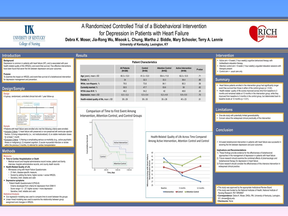
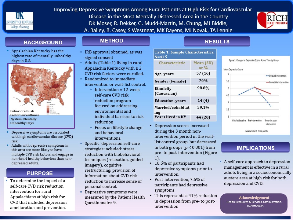
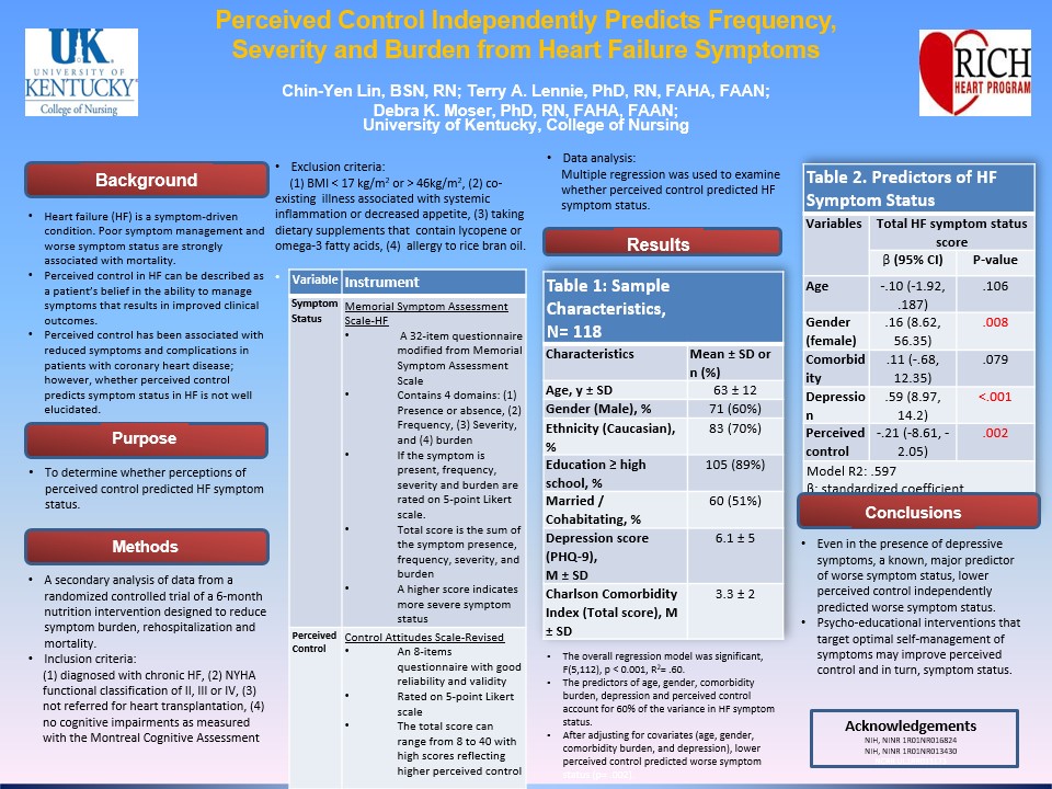
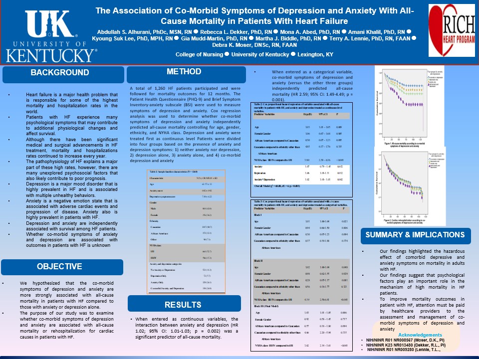
Example Posters